
PHOTO ALBUM
There are many variations of passages of Lorem Ipsum available, but the majority have suffered alteration in some form, by injected humour, or randomised words which don’t look even slightly believable. If you are going to use a passage of Lorem Ipsum, you need to be sure there isn’t anything embarrassing hidden in the middle of text. All the Lorem Ipsum generators on the Internet tend to repeat predefined chunks as necessary, making this the first true generator on the Internet. It uses a dictionary of over 200 Latin words, combined with a handful of model sentence structures, to generate Lorem Ipsum which looks reasonable. The generated Lorem Ipsum is therefore always free from repetition, injected humour, or non-characteristic words etc.

CLICK A THUMBNAIL BELOW TO VIEW A LARGER IMAGE
SPREADING THE GOOD NEWS.
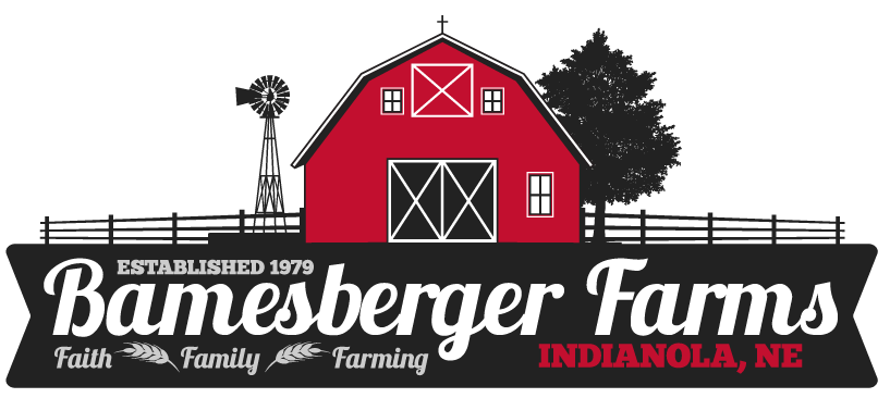
A local farmer who is good friends with my parents reached out to me to help him with a logo to brand his farming operation, but he also needed to bring his website into the 21st century, so this project became a multi-faceted one from the start. I started concepting the logo out from a couple of reference logos he sent over that he liked.
Since this client already had a website, I spent some time clicking around and found an aerial drone view of his headquarters that showcased an iconic red barn, ample feedlot space, and mature trees lining the property. I knew right away that the barn needed to be the anchoring component of this logo, and my color palette needed to support that. I chose a strong triad scheme of red, black, and gray for the main imagery with his primary business name in white.
I put together a sheet of font combinations once the main imagery was in place. I was thrilled when he picked the script style version as I knew I could easily incorporate that font family into my primary and secondary headings throughout his website, which would only further communicate and strengthen his brand.
This assignment was unique but also very rewarding, as this client is not only successful in agriculture, but also a very skilled writer as well. He routinely writes devotional content for his local church, and uses the website that I built him to share those words of encouragement with others. It was an honor to help him spread the good news!
Check out Phil's website on my Web Design project page or feel free to view it directly here.
CLOSE X
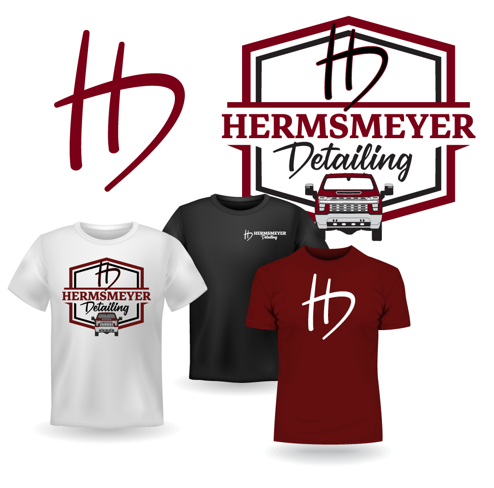
A DETAILING BUSINESS GETS DETAILED.
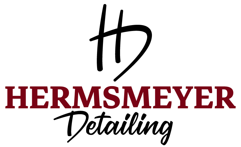
A friend's brother approached me about helping him brand his startup auto detailing business. He sent me a couple of loose sketches that involved a sort of "hand drawn" emotive using the initials of his business name - Hermsmeyer Detailing. His only other directive for me was his desire to include a Chevrolet Silverado into the base logo somehow.
I began my process by flexing through some bounding shape options. This particular business name would stretch the limits of any containing shape I tried to place it in, but I still felt that I needed a wrapping element to hold the text, the pickup graphic, and the "HD" script logo in relationship together. Auto detailing to me is all about clean lines and sharp edges, and so after some experimentation with other bounding shapes, I landed on the diamond as the best solution for this logo combination.
The main graphic element of the pickup derived from a vector blueprint wireframe that I was able to dig up from Chevy's corporate website. Starting from the diagram in Illustrator, I completely disassembled the layer structure and drastically simplified the truck until a workable shape with enough interior detail to still deliver on a "cool factor" without being too complex for a logo. This was admittedly a labor of love but I'm really happy with how the graphic turned out once I stripped it down and colorized it.
My wrestling continued into the final - and perhaps most important - piece of this logo project, the "HD" logomark. This client wanted the logomark to deliver on originality and simplicity, while still carrying a recognizable iconic look. The "hand-drawn" look was important to him, so I started researching some script-looking fonts for inspiration. I wanted to hold myself to three intersecting lines that conveyed motion, clean lines, and still delivered on his business acronym.
After many unsatisfactory attempts and numerous tweaks with the Pen and Width tools in Illustrator, I finally came up with the orientation that just "felt right". A LOGO MARK WAS BORN! Most importantly, my client was thrilled with the end product. I look forward to seeing this brand in the public eye!
CLOSE X
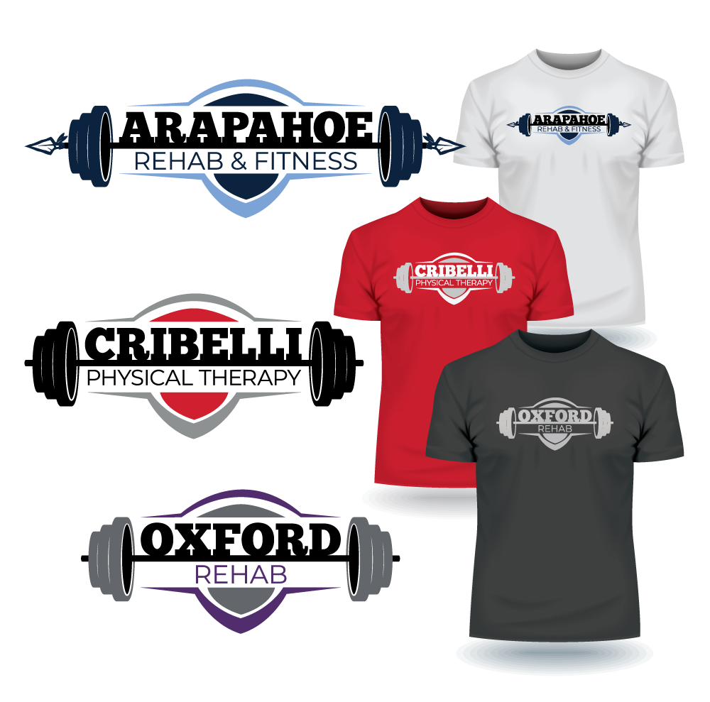
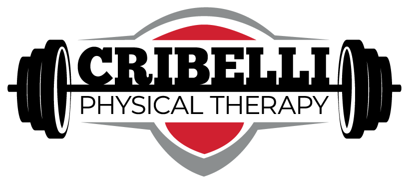
THESE LOGOS CARRY SOME WEIGHT.
I reunited with a high school friend who manages a multi-site physical therapy and rehabilitation business across three small communities in western Nebraska. This client came to me wanting a "brand family" of sorts, but also expressed that each logo should be able to stand alone as well. He also asked that the central design imagery be centered on a barbell.
Since each of the three business names varied greatly in their number of characters, I needed to come up with a secondary contextual element that would encase the lettering and help communicate that these three logos are indeed all part of the same ownership and management group. After some time researching examples in this industry for inspiration, I kept coming back the need here for a strong shape that suggested a "workout warrior" ideal without necessarily screaming it. I feel that the shield-shaped cut polygon in the background not only gives these logos character, but also helps to anchor the text.
These businesses exist in my hometown and two other neighboring communities, which really added to the intrinsic reward of this project. Not only was I helping a friend brand his business, I also had the opportunity to give back to the community that I owe a lot to.
CLOSE X
THESE LOGOS CARRY SOME WEIGHT.
I reunited with a high school friend who manages a multi-site physical therapy and rehabilitation business across three small communities in western Nebraska. This client came to me wanting a "brand family" of sorts, but also expressed that each logo should be able to stand alone as well. He also asked that the central design imagery be centered on a barbell.
Since each of the three business names varied greatly in their number of characters, I needed to come up with a secondary contextual element that would encase the lettering and help communicate that these three logos are indeed all part of the same ownership and management group. After some time researching examples in this industry for inspiration, I kept coming back the need here for a strong shape that suggested a "workout warrior" ideal without necessarily screaming it. I feel that the shield-shaped cut polygon in the background not only gives these logos character, but also helps to anchor the text.
These businesses exist in my hometown and two other neighboring communities, which really added to the intrinsic reward of this project. Not only was I helping a friend brand his business, I also had the opportunity to give back to the community that I owe a lot to.